
Instagram Has Grown Up
Instagram has unveiled its first major brand refresh in more than ten years.
The update reflects how the platform has evolved from a photo-sharing app into a much broader creative space filled with photography, video, memes, personal moments and cultural conversations.
Rather than creating a completely new identity, Instagram focused on building a system flexible enough to support all of those different voices.

Keeping What People Already Recognize
One of the biggest decisions involved Instagram’s familiar script wordmark.
The design team explored moving away from script entirely, but found that doing so made the brand feel less recognizable.
Instead, Instagram refined the existing idea, preserving the human and spontaneous qualities that have become closely associated with the platform.
A Brand System Built Around Creators
The new visual identity is intentionally designed to stay in the background.
Instagram wants creator content to remain the main character rather than allowing heavy branding to compete for attention.
The system therefore works more like a flexible creative framework than a rigid corporate identity.
Photography Returns to the Center
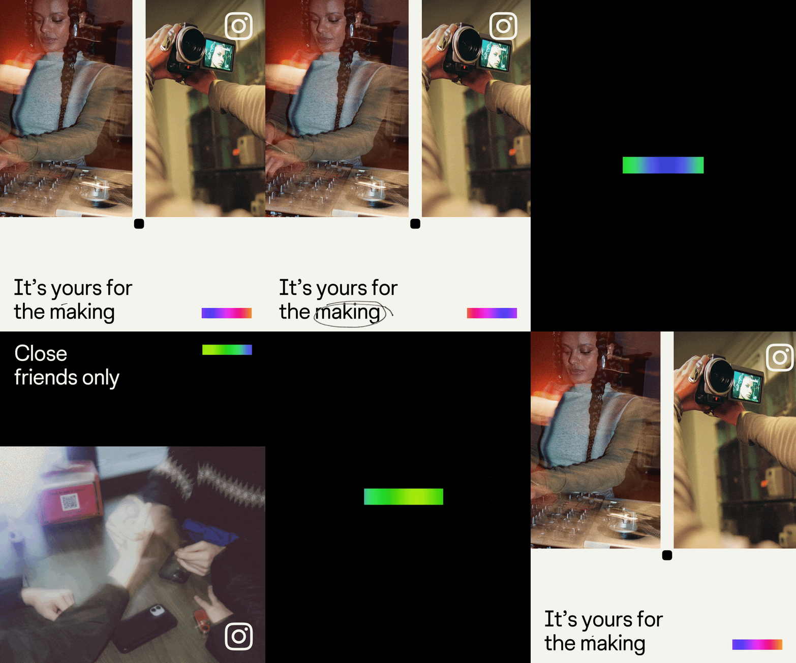
The refresh introduces visual references to traditional image-making, including contact sheets, registration marks, annotations and a new viewfinder device derived from Instagram’s camera glyph.
These elements connect the digital platform back to the physical process of framing, capturing and sharing images.

New Typography and a More Human Voice
Instagram has refined Instagram Sans and introduced Instagram Sans Mono.
The company is also developing Instagram Pen, a custom handwriting typeface designed to feel imperfect, personal and expressive.
A More Restrained Use of Colour
The iconic sunset gradient remains part of the identity, but it is now used more selectively.
Rather than dominating every execution, the gradient can appear more like a photographic light leak, while new variations give the system greater flexibility.
What Brands Can Learn
- A major refresh does not require abandoning recognizable assets.
- Strong identities can evolve while preserving familiarity.
- Brand systems should support content rather than compete with it.
- Imperfection can make digital brands feel more human.
- Restraint can be a sign of brand confidence.
Final Reflection: The Brand Does Not Need to Be the Main Character
Instagram’s refresh is notable because many of its changes are intentionally subtle.
The goal is not to make users stop and admire the branding.
It is to create a recognizable system that gives more space to the people, images and stories living inside it.
Summary
Instagram’s new identity is designed to support a platform that has grown far beyond photo sharing. Instead of competing with creator content, the refreshed system acts as a flexible canvas built around everyday creativity, imperfection and human expression.
Sources
FAQs
What changed in Instagram’s new identity?
Instagram refined its wordmark, typography, gradient and broader visual system while introducing new devices inspired by photography and image-making.
Did Instagram replace its script logo?
No. The team explored alternatives but ultimately retained and refined the script because it remains strongly connected to Instagram’s identity.
What is Instagram Pen?
Instagram Pen is an upcoming custom handwriting typeface designed to bring a warmer, more personal and imperfect quality to the brand.
What is the main idea behind the refresh?
The system is designed to champion everyday creativity while giving creator content more space to remain the focus.
Ready to advertise outdoors?
BM Outdoor plans, buys and prints OOH campaigns across all 50 states. Request a free quote with no commitment.














Comments
Be the first to comment.