Quick Answer
This billboard stands out by doing almost nothing visually and saying just enough emotionally. With a soft pink background and one intimate line, it turns a public space into a moment of vulnerability, tension, and instant curiosity.
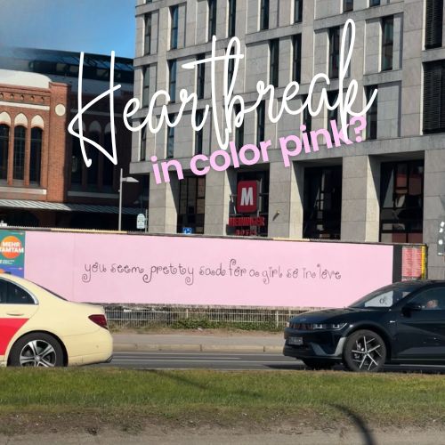
A pink billboard turns heartbreak into public poetry
This billboard works because it says very little but suggests a lot. With just one handwritten-style line on a soft pink background, it transforms a public space into an emotional moment that feels intimate, vulnerable, and impossible to ignore.
Minimalism becomes the message
Most outdoor ads fight for attention with scale, color, logos, and product shots. This one takes the opposite route. It uses a nearly empty pink background and a single sentence written in a delicate, almost diary-like style: “you seem pretty sad for a girl so in love.”
That restraint is exactly what gives it power. Instead of shouting, the billboard invites people to lean in emotionally. It feels less like advertising and more like a thought someone was never supposed to say out loud.

The line creates instant emotional tension
The copy is what makes the piece unforgettable. It sounds personal, almost confrontational, as if it belongs to a conversation, a text message, or a memory. In just a few words, it introduces contradiction: love is supposed to look joyful, yet the sentence suggests the opposite.
That tension is what keeps the audience engaged. The billboard does not explain the story, but it gives people enough to start building one in their heads. That kind of emotional participation is rare in OOH, and it is often what makes a piece truly memorable.
Soft visuals, sharp emotional impact
The visual treatment is deceptively gentle. The pastel pink background feels romantic, warm, and soft. The handwritten typography adds intimacy and vulnerability. But emotionally, the line lands much harder than the design suggests.
That contrast makes the billboard stronger. The softness draws you in, while the message leaves a sting. It is a good reminder that outdoor advertising does not always need visual noise to create impact. Sometimes a quiet execution can hit even harder.
Why this works so well in public space
Placed in a busy urban setting, the billboard creates an interesting tension between public and private. Roads, cars, buildings, and movement surround it, yet the message feels deeply personal. It almost turns the city into the backdrop of someone’s inner monologue.
That is why the piece feels so contemporary. It mirrors the language of emotional oversharing, texting culture, and confessional internet posts, but translates that tone into a large-format public canvas. The result feels modern, human, and highly shareable.

A lesson in emotional OOH
This billboard shows how powerful emotional minimalism can be in outdoor advertising. It does not depend on a complex production, digital effects, or heavy branding. It relies on a single line, a strong sense of tone, and the confidence to leave space around the idea.
For brands, artists, or campaigns trying to create resonance rather than just visibility, that is an important lesson: not every billboard needs to explain itself. Sometimes the strongest outdoor work is the one that leaves people thinking about it long after they pass by.
Summary
The power of this billboard comes from its restraint. Instead of relying on logos, product shots, or heavy design, it uses a single handwritten-style sentence to create emotional tension in seconds. The pink background softens the visual tone, while the copy introduces contradiction and sadness, making the piece feel intimate and public at the same time. It works because it reads like a private thought placed in the middle of the city. That combination of simplicity and emotional sharpness makes it highly memorable as OOH.
FAQs
What makes this billboard effective?
Its simplicity. The design is minimal, but the emotional line creates immediate tension and curiosity.
Why does the pink background matter?
It creates softness and romance, which makes the sadness in the copy feel even sharper.
Why does it work well in OOH?
Because the message is short, visually clear, and emotionally strong enough to land in just a few seconds.
Craft emotive OOH that resonates
Explore high-visibility print and OOH formats that elevate brand values and recall.


Comments
Be the first to comment.