Quick Answer
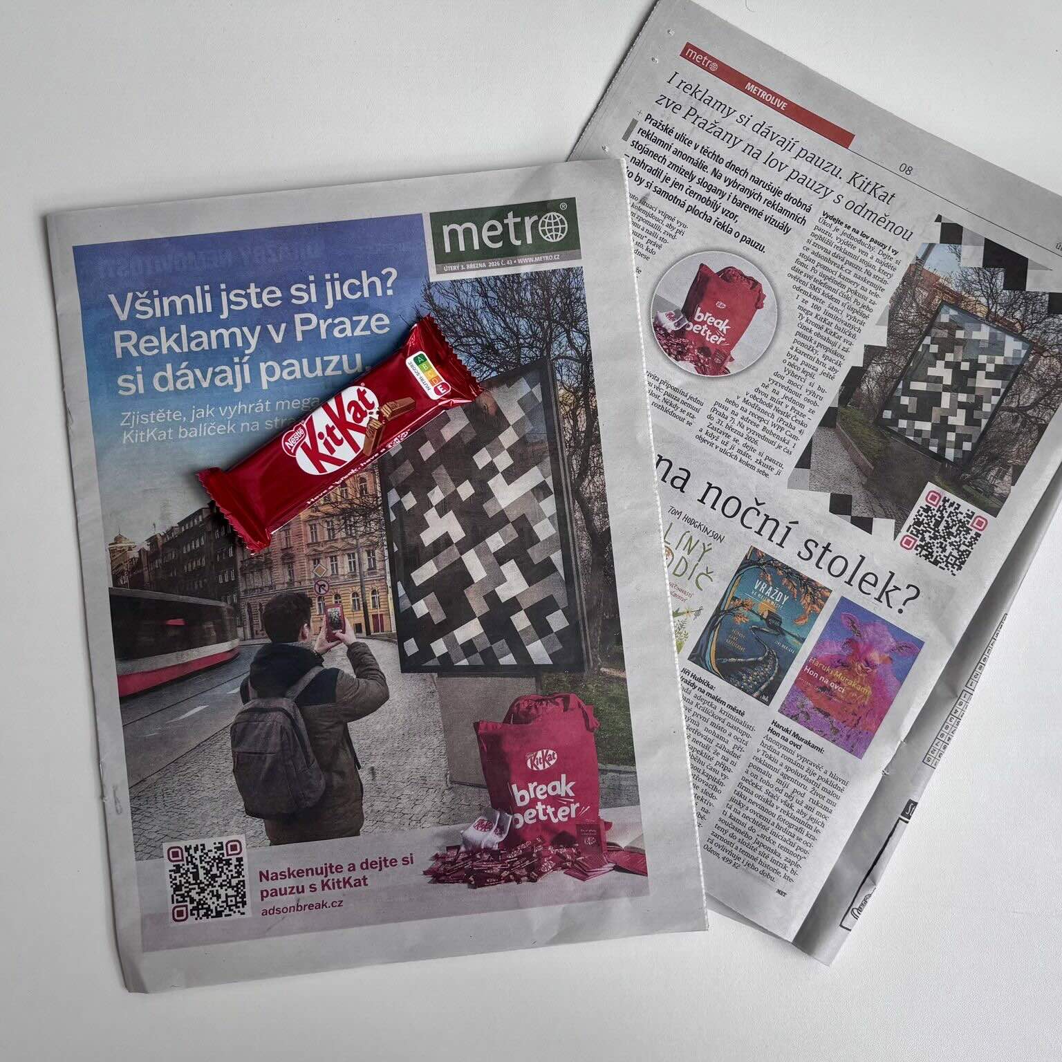
KitKat activated Prague’s OOH by turning bus shelters and street panels into “pause” moments that doubled as entry points to a giveaway.
People had to find the designs, photograph them, and upload the image to a campaign website to win KitKat bars and official merchandise.
How KitKat Turned the City Into a Real “Take a Break” Moment
KitKat has spent decades turning “the pause” into something bigger than a tagline. It’s a brand behavior—an instantly understood cue that signals permission to stop, reset, and keep going. What’s interesting about the Prague activation is that it doesn’t just communicate that idea; it stages it in public space, using the city itself as the medium.
Instead of treating out-of-home as a static broadcast channel, KitKat approached it like a scavenger-style interaction built for real urban routines. People are already moving fast, already scanning their environment, already documenting things they find interesting. So the campaign uses OOH as the first step in a short, intuitive journey: you notice something unusual, you capture it, and you unlock a reward. That shift—from passive viewing to active participation—is where the idea gains energy while still staying unmistakably “KitKat.”
At a deeper level, it’s also a smart response to how attention works in cities. Commuters don’t want explanations; they want cues. This campaign leans into that: minimal visual language, immediate intrigue, and a clear next action that lives where people already spend time—on their phones.
The Activation: Bus Shelters and Street Panels That Unlock a Giveaway
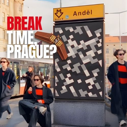
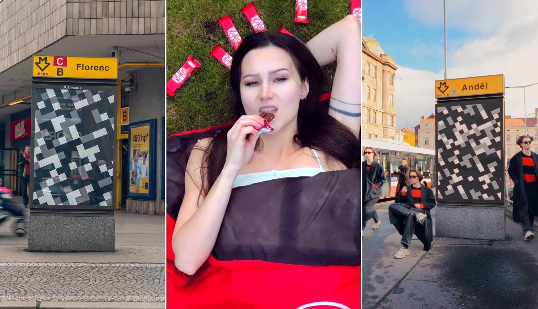
The activation rolled out across Prague using familiar street furniture—mupis and bus shelters—because those formats live inside daily movement patterns. You don’t have to go out of your way to encounter them; you run into them while commuting, walking, waiting, or crossing a busy corridor. That’s important because a “pause” message lands best when the environment is already a transition moment.
Creatively, KitKat made a strong choice: it avoided heavy branding and went for geometric patterns in a restrained palette (black, white, grey) that visually echo the logic of QR codes without behaving like a standard QR. That “almost scannable” look is a psychological hook. People recognize the visual language instantly—our brains have learned to interpret QR-like patterns as gateways—so curiosity kicks in before comprehension. You feel like there’s something to unlock.
The campaign then bridges street-to-digital in a way that feels modern but not complicated. Instead of asking users to scan a code on the spot, the brand routes the instructions through Instagram, which does two things at once: it makes the mechanic feel socially “approved” (it lives in a channel people trust and check daily), and it gives creators a natural place to amplify the idea. From there, users photograph the OOH placement and upload the image to a dedicated website—simple enough to do quickly, but interactive enough to feel like you “did something.”
The Reward: Scarcity, Collectibility, and a Bundle That Feels Worth the Effort
The prize design is doing more work than it might seem. Limiting the reward to the first 100 participants adds real urgency and pushes action into a short time window—exactly the kind of pressure that makes “city hunts” spread. It also gives the activation a clean narrative arc: there’s a finish line, and it can be reached fast.
The bundle itself matters because it’s not a token giveaway. It’s a branded “break kit,” mixing KitKat bars with merchandise that feels lifestyle-coded: tote bag, socks, notebook, sleeping bag. That combination raises perceived value and makes the reward feel collectible rather than disposable. In other words, it doesn’t feel like you’re doing work for a coupon—it feels like you’re unlocking something limited.
It’s also strategically photogenic. A chocolate bar is satisfying but fleeting; merch is visible for weeks or months. When winners post their bundle, the campaign extends beyond the street and beyond the contest period. The reward becomes media.
And then there’s the positioning layer: the campaign doesn’t frame the pause as laziness—it frames it as wellness. In a city context, that’s a strong emotional counterpoint. The activation essentially says: the pace is intense, the environment is noisy, and that’s exactly why the pause matters. It’s an idea that fits naturally inside modern conversations about mental and physical well-being without feeling preachy.
Why This OOH Idea Works: It’s Built for Real Behavior, Not Perfect Attention
This is the type of OOH that doesn’t demand long attention spans. It earns attention through pattern disruption (the QR-like look), then converts attention through low-friction action (photo + upload), and extends attention through social amplification (Instagram + creators + the physical bundle).
It also balances novelty with clarity. The creative is mysterious enough to pull you in, but the mechanic is straightforward once you know the rules. That’s the sweet spot for interactive OOH: intrigue first, instructions second.
Finally, it’s a great example of how outdoor can become a participation layer instead of just a message layer. The street becomes the interface, the phone becomes the connector, and the reward becomes the story people want to share. When creators amplify the “hunt,” the activation turns into a small cultural moment inside the city—exactly the kind of outcome brands want from experiential work, but delivered through everyday infrastructure.
Summary
Developed with VML Czech Republic, the campaign translates KitKat’s “take a break” promise into a real-world urban experience.
Minimal geometric designs resembling QR-style patterns sparked curiosity and pushed people from street to Instagram instructions to a dedicated upload site.
The first 100 participants received collection details for a merch + product bundle, and the activation was amplified through creators and influencers to scale reach and reinforce the well-being message.
FAQs
What was KitKat trying to achieve with this campaign?
To make its “take a break” message tangible—turning outdoor ads into real pause moments that people can discover and interact with.
How did people enter the giveaway?
They found the special OOH designs, photographed them, and uploaded the photo to a dedicated campaign website (guided by instructions shared on Instagram).
Why use QR-like patterns instead of a normal QR code?
Because it sparks curiosity and interaction while keeping the creative clean—people recognize the visual language and feel compelled to “figure it out.”
Craft emotive OOH that resonates
Explore high-visibility print and OOH formats that elevate brand values and recall.


Comments
Be the first to comment.