
Quick insight: Brandt’s 10th-anniversary rebrand is not about making the gallery visually louder than its artists. Bureau Brandt instead created a confident but restrained identity that gives the institution greater recognition while leaving enough space for the art itself to remain the hero.
Ten Years Marks A New Chapter For Brandt
Ten years after opening its doors, Amsterdam’s Brandt gallery has introduced its first major rebrand.
The transformation was developed by newly formed design studio Bureau Brandt and arrives at an important moment in the gallery’s evolution.
Known for dynamic programming that includes exhibitions and performances within its main space, the gallery has also established an international presence through participation in art fairs including The Armory Show, Untitled Art, NADA New York and Art Toronto.
The anniversary therefore offered an opportunity to look beyond the gallery’s first decade and create a visual framework capable of supporting its ambitions on a broader global stage.
From Rutger Brandt Gallery To Simply Brandt
The most significant change is also one of the simplest.
Rutger Brandt Gallery is now Brandt.
The shortened name reflects a shift in how the institution sees itself.
While founder Rutger Brandt remains an important part of its foundation, the gallery has increasingly evolved toward something more collective and open-ended.
Removing the founder’s first name gives Brandt a more independent identity while creating space for the artists, ideas and wider community around the gallery.

A Family Connection Behind The New Identity
For the project, Rutger Brandt approached family member Sophia Brandt, who recently founded Bureau Brandt after spending six years at North design studio.
The brief was not simply to create a new logo.
The goal was to establish a design framework flexible enough to support the gallery’s changing direction and ambitions while strengthening its presence within the international art world.
That required balancing two competing needs: giving Brandt a recognizable identity without allowing the branding to overpower the work exhibited within it.
A Custom Wordmark Built For Confidence
At the center of the new identity is a custom Brandt wordmark.
The logo balances boldness with simplicity, creating an immediately recognizable signature without introducing unnecessary visual complexity.
The shorter name makes that approach even stronger.
“Brandt” can function almost like a stamp across gallery communications, exhibition materials and other brand applications.
The result is an identity that feels more confident while remaining adaptable to different artists, exhibitions and contexts.

Typography Adds Personality
Across the wider visual system, Bureau Brandt uses ABC Laica from Swiss type foundry Dinamo.
The typeface introduces a more playful and personal quality to the gallery’s communication.
ABC Laica itself draws inspiration from the dialogue between two contrasting writing tools: the broad-nib pen and the pointed-nib pen.
That contrast creates a useful balance between structure and expression.
For an art gallery, this relationship is particularly appropriate because the identity needs enough structure to remain recognizable while still accommodating a constantly changing collection of artistic voices.
Black And White Lets The Artists Take Center Stage
The color system follows a similarly restrained philosophy.
Black and white form the foundation of the new Brandt identity.
Rather than competing visually with artworks, this neutral palette creates a framework around them.
The approach supports Brandt’s ambition to become a more community-focused platform by ensuring that the artists and their work remain the strongest visual elements.
This is an important distinction for cultural branding.
A gallery identity needs to be recognizable, but it also needs to know when to step aside.

Bright Blue Creates Moments Of Recognition
The identity is not entirely monochromatic.
Occasional splashes of bright blue introduce moments of stronger Brandt ownership.
Importantly, the color is used sparingly rather than becoming a dominant visual device.
This selective use gives the blue greater impact when it appears.
It creates recognizable brand moments while preserving the flexibility of the broader black-and-white system.
Designing A System Rather Than A Single Look
One of the strongest aspects of the rebrand is that it functions as a framework rather than a rigid template.
Art galleries face an unusual branding challenge because the visual material they communicate is constantly changing.
One exhibition may be minimal and monochromatic, while another may be filled with color, photography, sculpture or performance.
An overly dominant identity could easily compete with those different creative worlds.
Bureau Brandt’s system instead provides consistent typography, naming and visual cues while allowing individual artists to occupy the foreground.
Taking A New Brand Identity Into The Real World
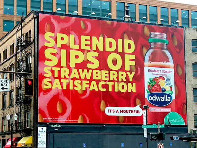
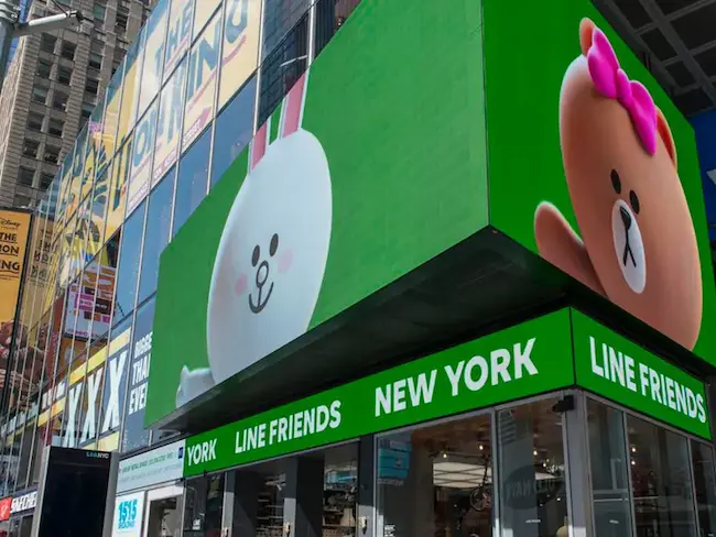
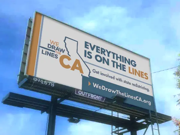
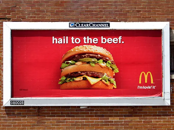
A rebrand becomes especially powerful when it moves beyond websites, stationery and social media and begins occupying physical public space.
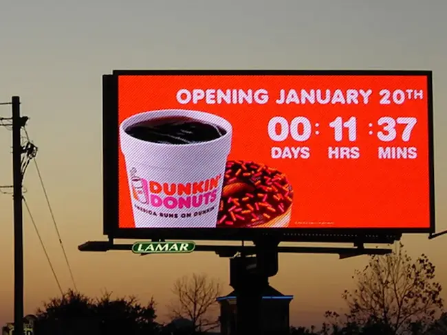
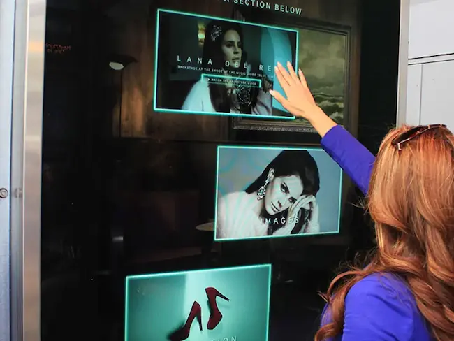
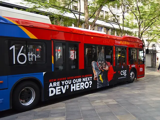
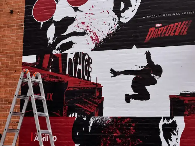
A new wordmark, typography system or visual language can be translated into billboards, digital screens, street furniture, transit media, murals and other OOH formats that introduce the refreshed identity at city scale.
For galleries, cultural organizations and brands entering a new chapter, this can turn a visual identity launch into a broader public statement.
BM Outdoor can help brands take this next step, developing and coordinating OOH and DOOH campaigns that bring new identities, product launches and creative platforms into high-impact physical environments.
The objective is not simply to place a logo on a billboard, but to identify the formats, markets and locations that allow the new brand system to become a memorable real-world experience.
A Local Gallery With Global Ambitions
Brandt’s evolution also reflects the gallery’s growing international outlook.
Its participation in art fairs such as The Armory Show, Untitled Art, NADA New York and Art Toronto places the Amsterdam gallery within a much broader cultural conversation.
A clearer and more confident identity can help create consistency as Brandt appears across different cities, fairs and cultural environments.
The shorter name is particularly effective in this context because it is concise, memorable and easier to establish as a standalone international brand.
Why This Rebrand Works
- Uses the gallery’s 10th anniversary to signal a genuine institutional evolution.
- Simplifies Rutger Brandt Gallery into the stronger and more collective Brandt name.
- Introduces a custom wordmark that balances confidence with simplicity.
- Uses ABC Laica to add personality without overwhelming the visual system.
- Keeps black and white as the foundation so artists remain visually dominant.
- Uses bright blue selectively to create recognizable Brandt moments.
- Creates a flexible framework capable of working across exhibitions, art fairs and international contexts.
Key Takeaways For Marketers And Designers
- A milestone can provide a meaningful reason for a brand to reconsider its identity.
- Shortening a name can communicate a larger strategic change when the organization itself is evolving.
- Strong cultural branding does not always need to dominate the content it represents.
- Typography can provide personality while a restrained color system maintains flexibility.
- A selective accent color can become more distinctive than a palette used everywhere.
- A refreshed identity can gain greater visibility when translated into physical OOH and DOOH environments.
- The most useful identities are systems designed to accommodate future change rather than a single fixed visual treatment.
Final Thought
Brandt’s transformation is less about leaving its first decade behind and more about building a stronger foundation for what comes next.
The shorter name, custom wordmark, expressive typography and restrained color palette give the gallery a clearer voice without taking attention away from the artists it represents.
After ten years, Brandt is entering its next chapter with an identity designed not only to reflect where the gallery has been, but to give it room to continue evolving, experimenting and building its presence on the global art stage.
Bring Your Brand To Life With BM Outdoor
A strong identity deserves to be seen beyond the screen. Whether your company is launching a new brand, introducing a rebrand, promoting an exhibition or looking for a creative way to make a bigger public statement, BM Outdoor can help bring that vision into the real world through OOH and DOOH advertising.
From large-format billboards and digital screens to transit advertising, murals, special builds and strategic multi-market campaigns, we help brands identify the right formats and locations to transform creative ideas into memorable public experiences.
Ready to make your next campaign impossible to ignore? Connect with BM Outdoor and let’s bring your idea to the streets.
Frequently Asked Questions
The gallery used its 10th anniversary as an opportunity to create a stronger foundation for its next chapter and develop a more collective, open-ended identity.
The gallery changed its name from Rutger Brandt Gallery to simply Brandt.
The new identity was developed by Bureau Brandt, the design studio founded by Sophia Brandt.
The identity uses ABC Laica from Swiss type foundry Dinamo to give the gallery's communication a playful and personal quality.
The identity primarily uses black and white, allowing artists and their work to take center stage, with occasional bright blue accents used selectively.
Ready to advertise outdoors?
BM Outdoor plans, buys and prints OOH campaigns across all 50 states. Request a free quote with no commitment.





Comments
Be the first to comment.